The Most Important Control in the Cybercab Is for Emergencies Only
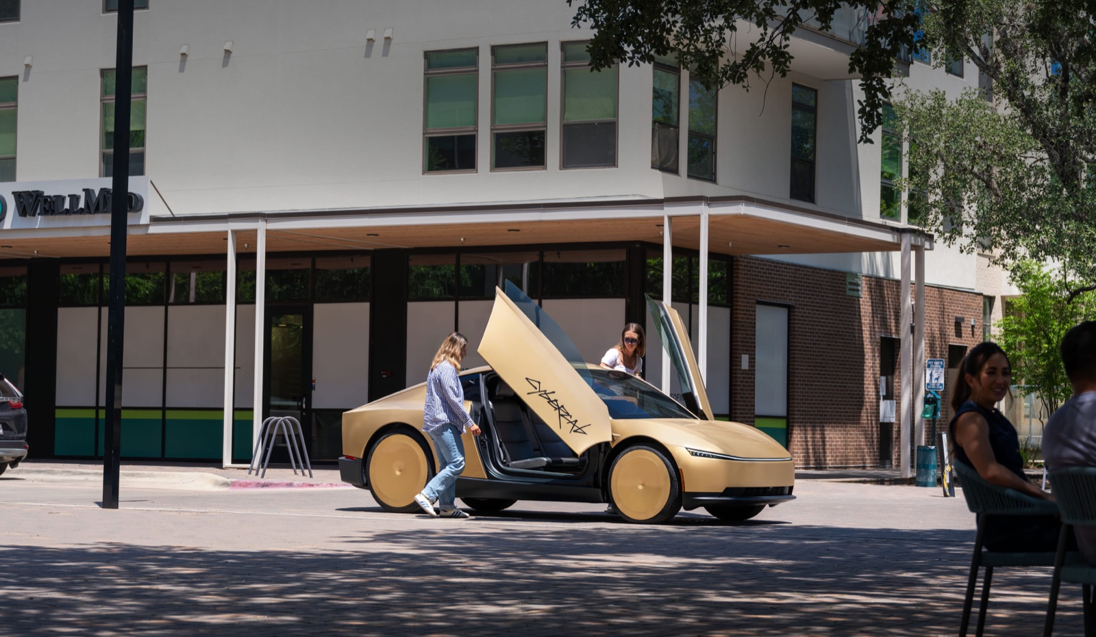
The most important control in the Cybercab is one Tesla says is for emergencies only.
No steering wheel. No pedals. No mirrors. But there is a physical Stop button between the dome lights.
Press it and the car requests an immediate pull-over and ends the ride.
A button you don't technically need
You can already do that from the touchscreen. You can do it from the app. The button exists anyway.
That's the design decision I keep coming back to. Tesla built a car that has no use for a driver, then looked at the one moment a passenger feels least in control, alone in a two-seat pod with no wheel, and decided a screen was not enough.
Think about what that admission costs a company like Tesla. This is the most software-defined car maker on earth, a company that famously rips physical controls out of everything it ships. Stalks, buttons, gear selectors, all migrated into glass. And at the exact point where the product's entire promise is on the line, the moment a stranger trusts a robot with their body, they reached for injection-moulded plastic.
Trust has a physical component
The button is not a feature. It's an admission that trust has a physical component software can't replace.
A touchscreen asks you to find the right menu while your heart rate is climbing. It might be mid-animation, mid-update, or showing you a map. A physical button is always in the same place, always does the same thing, and works when you're not looking at it. Your hand can find it while your eyes are shut. That's not an interaction pattern. That's the difference between a promise and a guarantee.
I wrote something similar about the voice-mask people: design isn't just the interface, it's the room the interface lives in. In the Cybercab, the room is two seats, no wheel, and a passenger who has surrendered every other form of control. The button is the room admitting what its occupant is feeling.
The question simplification never asks
Most simplification work asks what can be removed.
The better question is which control has to survive when the user is scared.
Removal is easy to justify. Every element you delete makes the demo cleaner, the marketing shots calmer, the spec sheet more futuristic. The discipline isn't in the removing. It's in knowing where to stop, and that requires knowing your user's worst moment better than they do. Tesla's designers clearly asked it. The wheel could go. The pedals could go. The exit could not.
Every product has that moment
Yours does too. The bulk delete. The payment confirmation. The export that can't be undone. The cancel button that decides whether the customer leaves calmly or leaves furious.
Strip everything around it. Leave that one thing solid, obvious and impossible to misunderstand.
Most of the business apps I design have at least one of these moments, and they're never in the pretty parts. They're payroll runs, roster overrides, permanent deletions. Software has spent a decade doing the opposite with them: burying the exits and greying out the escape hatches. I've written about what it feels like when a product blocks the way out. Every dark pattern is a Stop button someone chose not to build.
And notice which moments get the physical treatment elsewhere. Operating theatres have a big red gas cutoff. Factory lines have e-stops on every station. The dispatch desk I designed had one action that always stayed on screen, in the same place, no matter what state the system was in. When the cost of confusion is real, mature industries stop trusting glass.
The button is the whole design
Tesla removed the controls that let a human drive.
Then gave the passenger one physical button, for the moment they want out.
Nobody will review the Cybercab by its Stop button. Reviews will cover the range, the price, the door mechanism. The button will be a footnote, which is exactly right, because the best design work never draws attention to itself. It just sits there between the dome lights, mostly never pressed, quietly making the rest of the product possible.
The button is the whole design.
---