The Most Interesting Thing About the iPhone Duo Isn't the Second Screen. It's the Second User.
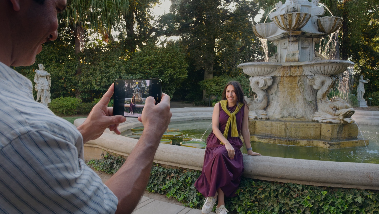
The most interesting thing about the iPhone Duo isn't the second screen.
It's the second user.
Take someone's photo and the outer screen shows them the live frame, so they fix their own pose.
Photograph a kid and it plays Peanuts animations to pull their eyes to the lens.
Start a FaceTime call and the person beside you joins through the other side of the phone.
Three features, one insight
Read those three features again and notice what they have in common. None of them do anything for the person holding the phone. The photographer doesn't frame better because the subject can see themselves. The parent doesn't hold the camera steadier because Snoopy is dancing on the back.
The value lands entirely on the other person in the moment. The one who, until now, every phone ever made treated as scenery.
Everyone else was a subject
Phones have always been built for one person.
One screen. One pair of hands. One user.
Everyone else in the moment was a subject. Something to be captured, framed, shown things, handed the device awkwardly rotated. Two decades of smartphone design refined the experience of the holder while the person on the other side of the lens got a black slab pointed at them like an instrument.
Apple designed a screen for them.
That's the shift. Not folding glass, not hinge engineering. Someone in Cupertino asked who else is in the room when this product gets used, and gave that person an interface.
Every product has a second user
The user isn't always the person holding the product.
This is one of the first things you learn designing business apps, because in operational software the second user is everywhere. The account holder isn't the person at the counter being served by it. The rostering tool is operated by a manager, but the people who live with its output are the staff whose weekends it decides. The dispatch desk I designed was driven by one operator, and every decision on that screen landed in the cab of a truck driver who never saw the interface.
Consumer products are full of second users too, mostly ignored. The card reader spun around for a signature. The boarding pass scanned upside down. The kiosk that makes the customer watch the staff member fight a UI designed for neither of them. Even the voice-mask people in open offices are a second-user failure: prompting works fine for the speaker, and everyone else in the room absorbs the cost.
We're good at empathy for the buyer, because the buyer holds the wallet and fills in the NPS survey. The second user files no tickets and answers no surveys. They just have an experience nobody designed.
Design for the person not holding it
Once you look for it, the best design decisions of the last year are second-user decisions. Tesla's Cybercab Stop button exists for a passenger who was never the driver. The $64 million bus app failed because it was built for the transit agency operating it, not the commuter standing in the rain.
The audit is simple. Walk through the moment your product gets used and count the people in it. Then count how many of them you've designed anything for. If those numbers don't match, that gap is where your product feels rude, and someone else's next release, like Apple's, is where it gets fixed.
The second user was always there
Apple didn't discover a new person. The subject of the photo, the kid with wandering eyes, the friend leaning into the call, they were always in the frame. What changed is that a company finally spent hardware on them.
The user isn't always the person holding the product.
The best products know who else is in the room.
---