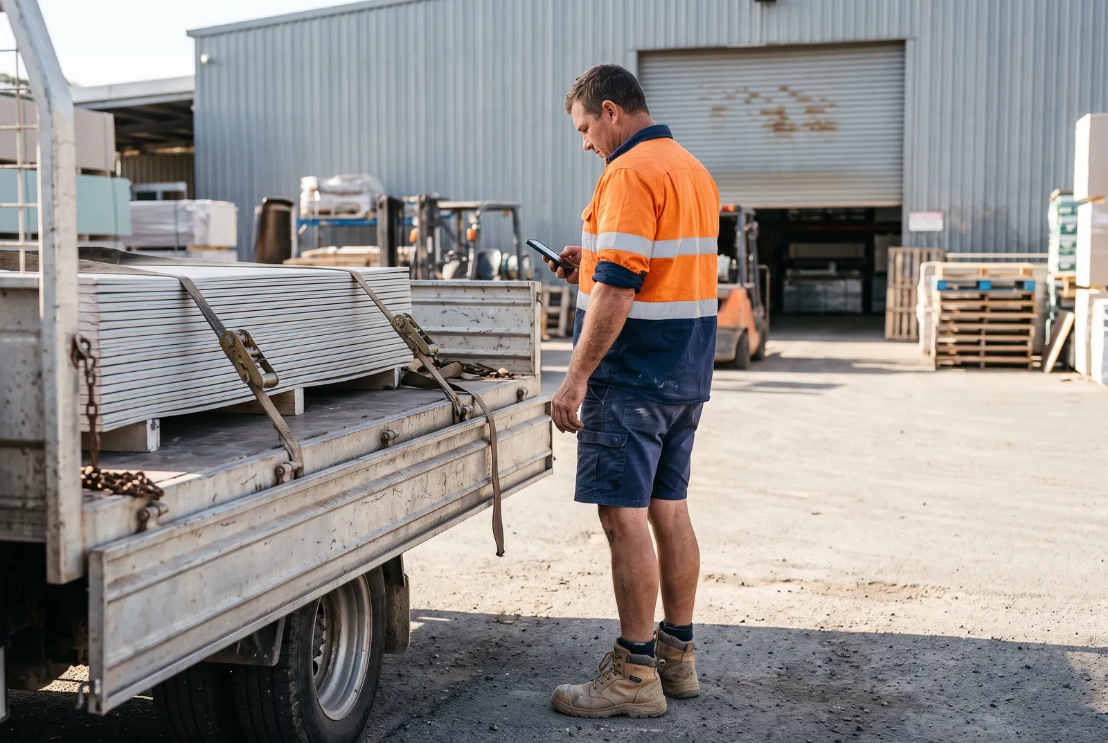
A building supplies distributor ran its delivery fleet on paper, phone calls and one warehouse manager's memory. I designed the operation as three connected apps, so each person sees what they need at the moment they need it.
- Client
- Delivery fleet
- Building supplies, Australia
- My role
- Product designer
- UX, UI and workflow
- Scope
- Three apps
- Office, driver and warehouse
- Status
- Shipped
- In use by the client
The problem
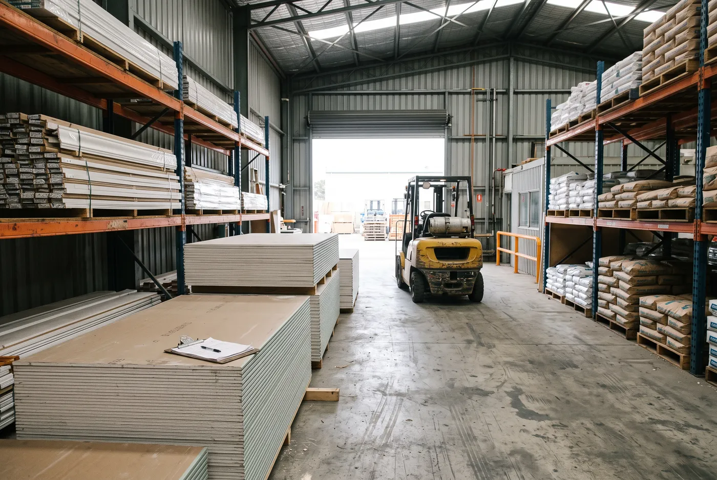
A delivery sounds like one thing. It is at least four. Someone in the office creates the job, someone in the warehouse picks the materials, a driver loads and delivers them to two or three sites, and a manager sorts out whatever went wrong.
Each of them already did their job. What failed were the handoffs. A driver would arrive at a site and the goods had never been picked. A delivery photo could not be found three weeks later when a customer disputed it. A truck loaded in the wrong order meant reshuffling the load at every stop.
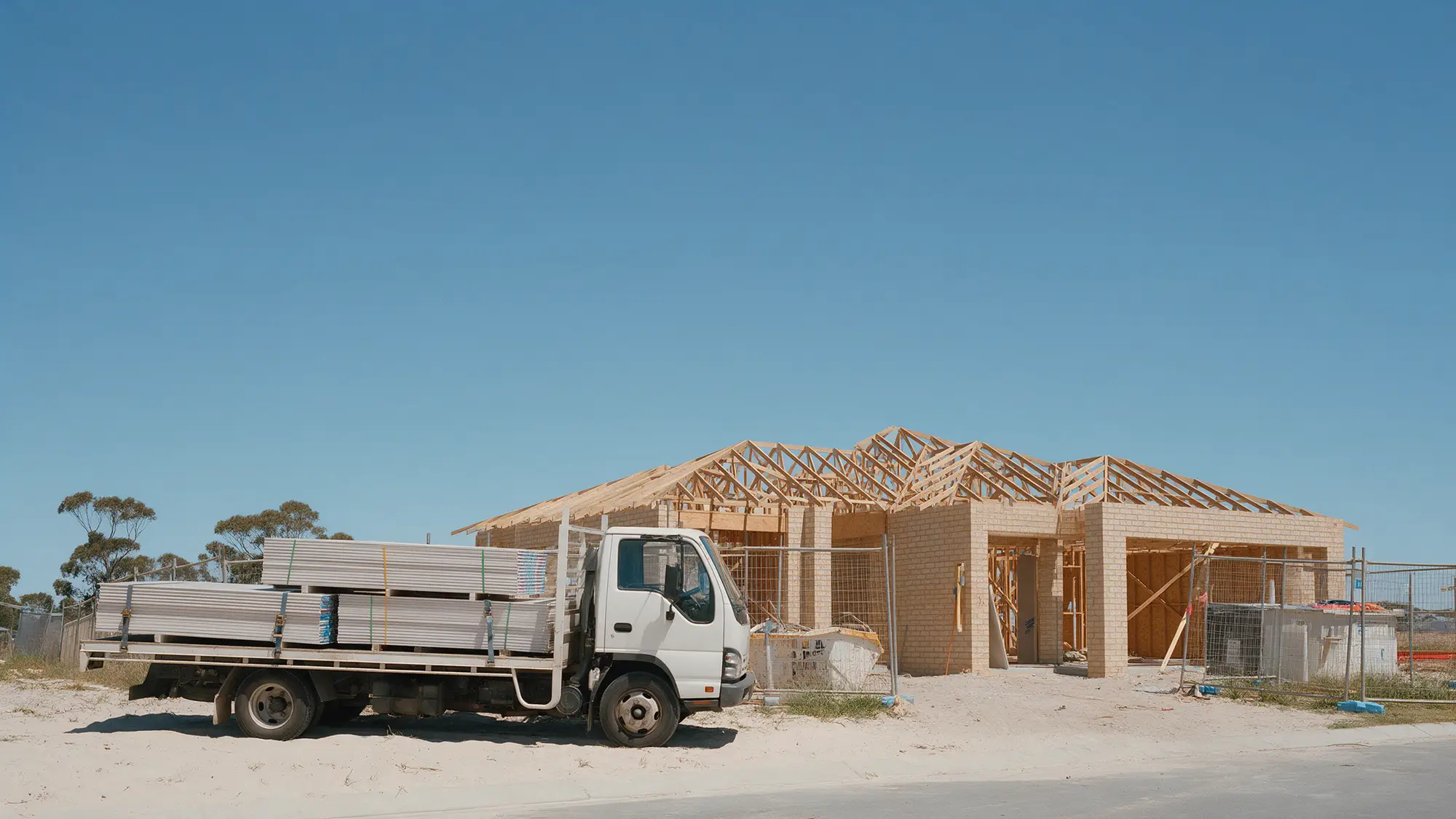
The brief was a phone app for drivers. The real problem was who knows what, and when.
What I designed
- 01
Office and manager
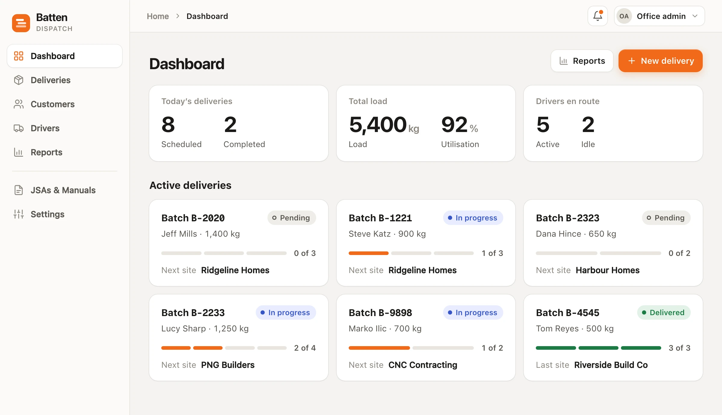
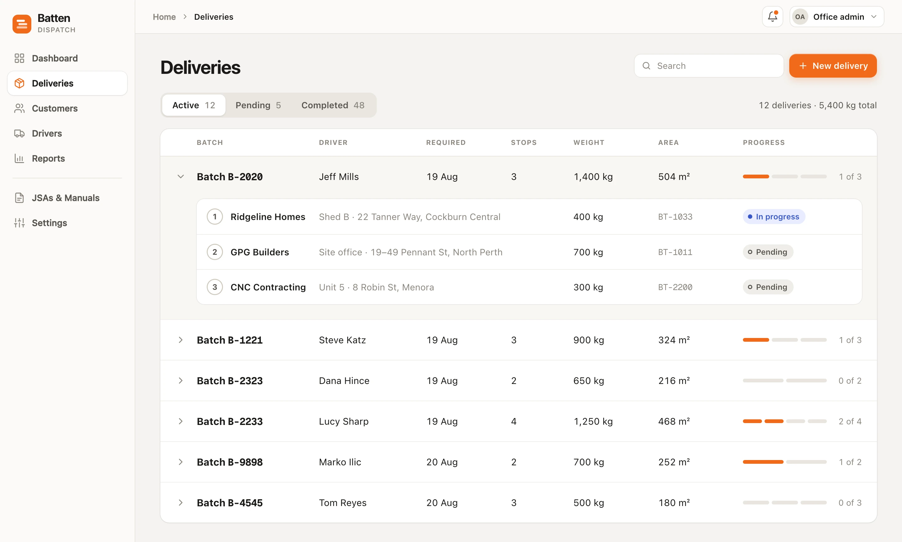
Creates the job · Web appCreate a delivery from an existing order, assign a truck, and watch every job from created to delivered.
- 02
Warehouse
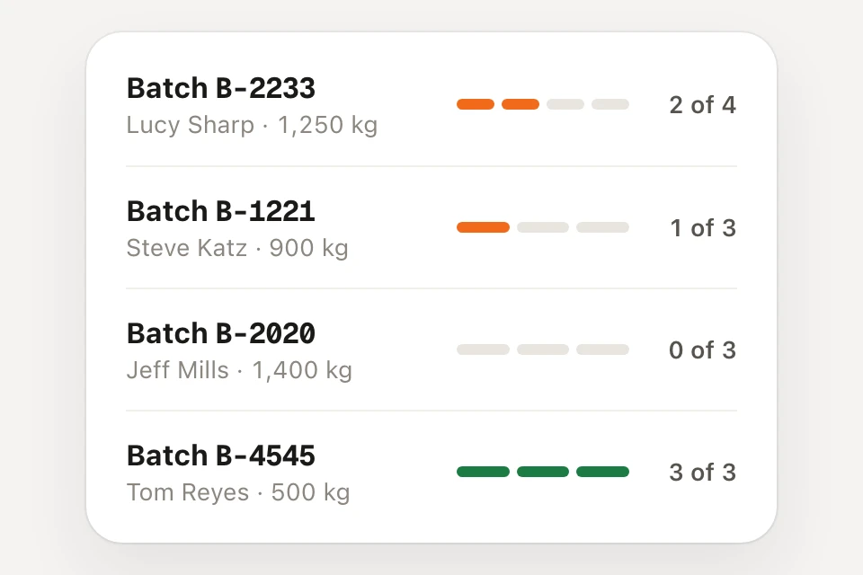
Picks and stages · Phone appPick each order and stage it in the sequence the truck needs to be loaded.
- 03
Driver
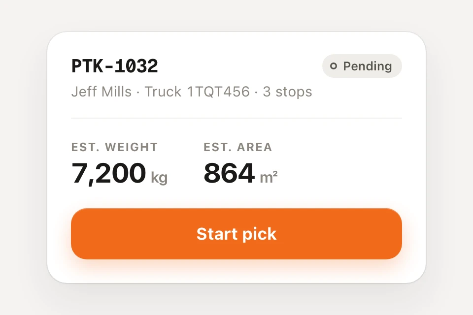
Loads, delivers, proves · Phone appOne task at a time: load, check, drive, deliver, and prove each drop with photos.
The decisions that mattered
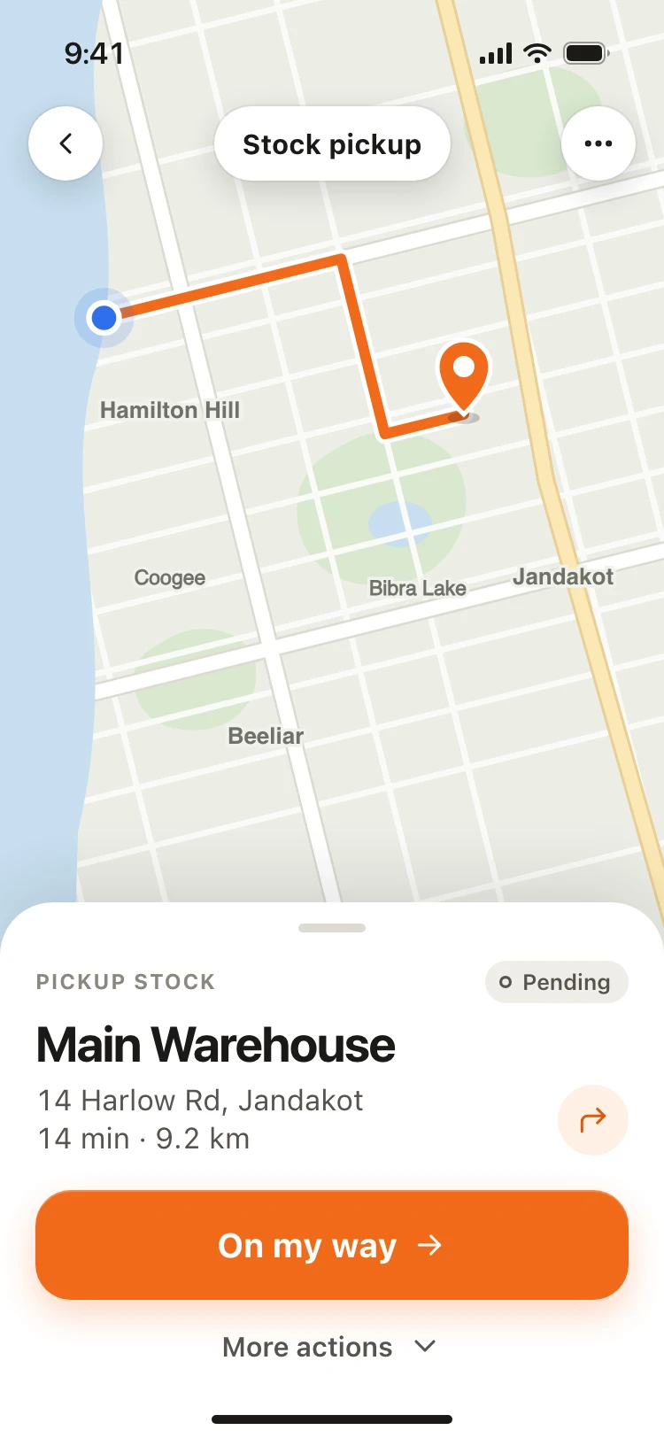
Drivers see one task at a time
A driver is standing at the back of a truck, often holding something, often in the rain. The app shows the next thing to do and almost nothing else. That means more screens and no menu to fall back on, so the sequence had to be right.
- Instead of
- Every job and action on one dashboard
- I chose
- The next action, and nothing else
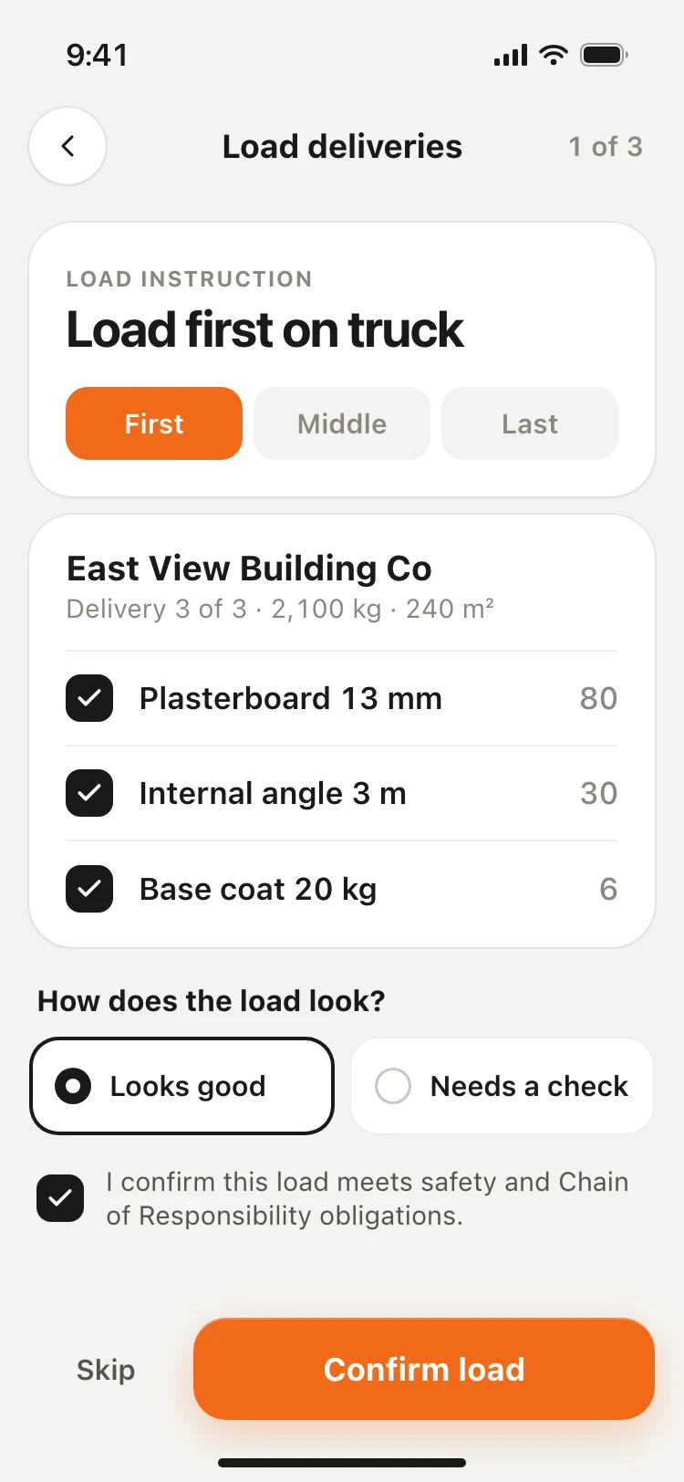
Load order is the reverse of delivery order
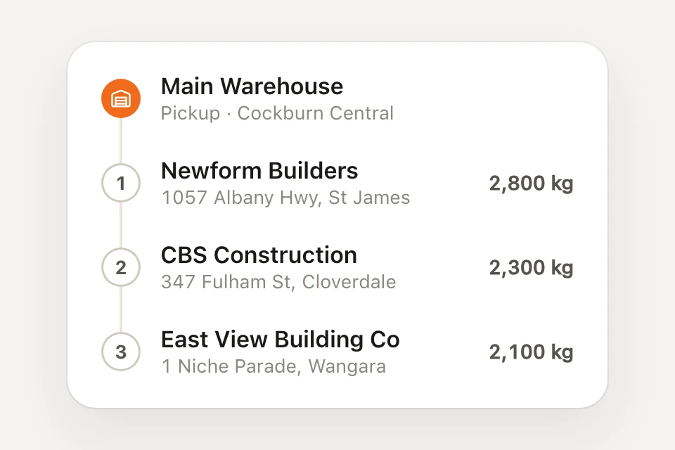
A truck carries two or three deliveries. If the first drop is loaded first, it ends up buried. The loading screen gives an instruction (load first, middle, last) where a plain list of what is on the truck would have said nothing about access.
- Instead of
- A list of what is on the truck
- I chose
- Load first, load middle, load last
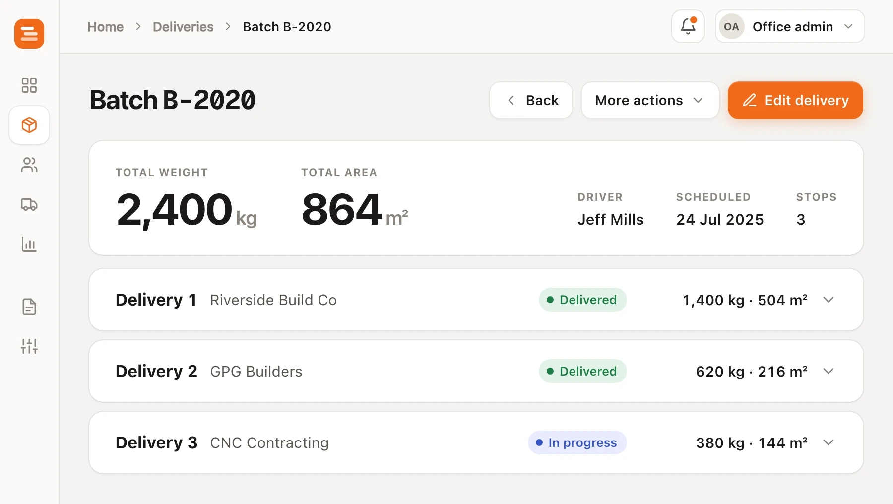
Weight and area, not sheet count
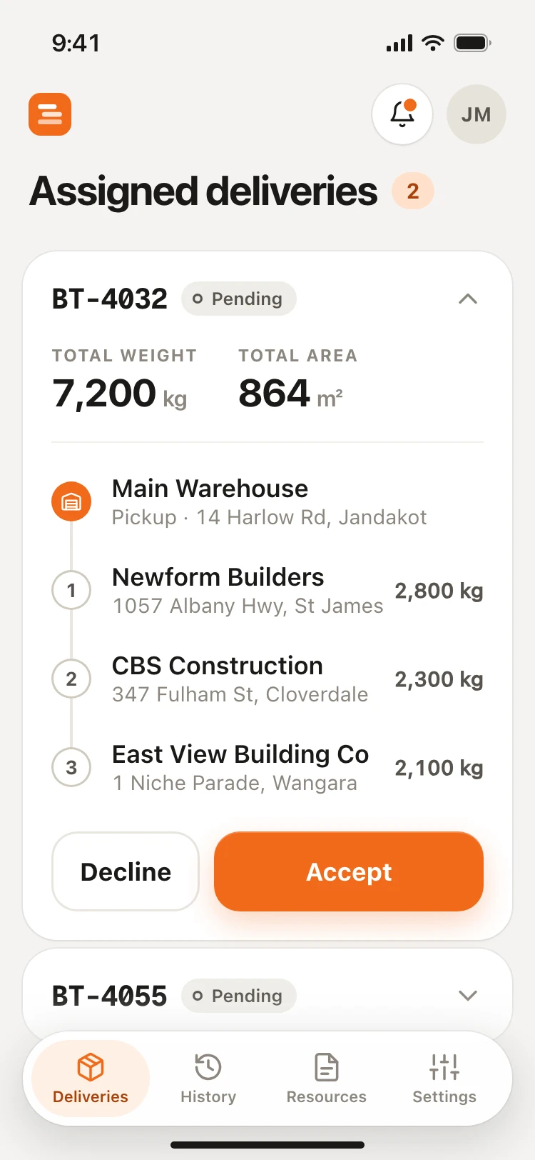
Early designs led with the number of sheets. The client corrected it: a manager needs total weight, to know the truck can carry the load, and total square metres. Sheet counts moved down into the product lists.
- Instead of
- The number of sheets
- I chose
- Total weight and total square metres
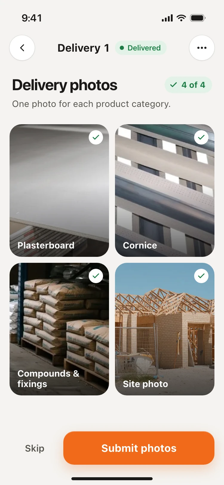
Evidence people will actually capture
Asking for a photo of every product turned a two-minute step into a chore that drivers would skip. It became one photo per product category. For the condition check, radio buttons with no default replaced a checkbox, so an untouched screen can never pass as an answer.
- Instead of
- A photo of every product, and a checkbox
- I chose
- A photo per category, and a forced choice
A driver's day
Five screens, in the order a driver meets them.
01 Accept the job
The whole run, with its total weight and area.
02 Head to the warehouse
One address, one map, one button.
03 Check the load
Tick off each order and confirm its condition.
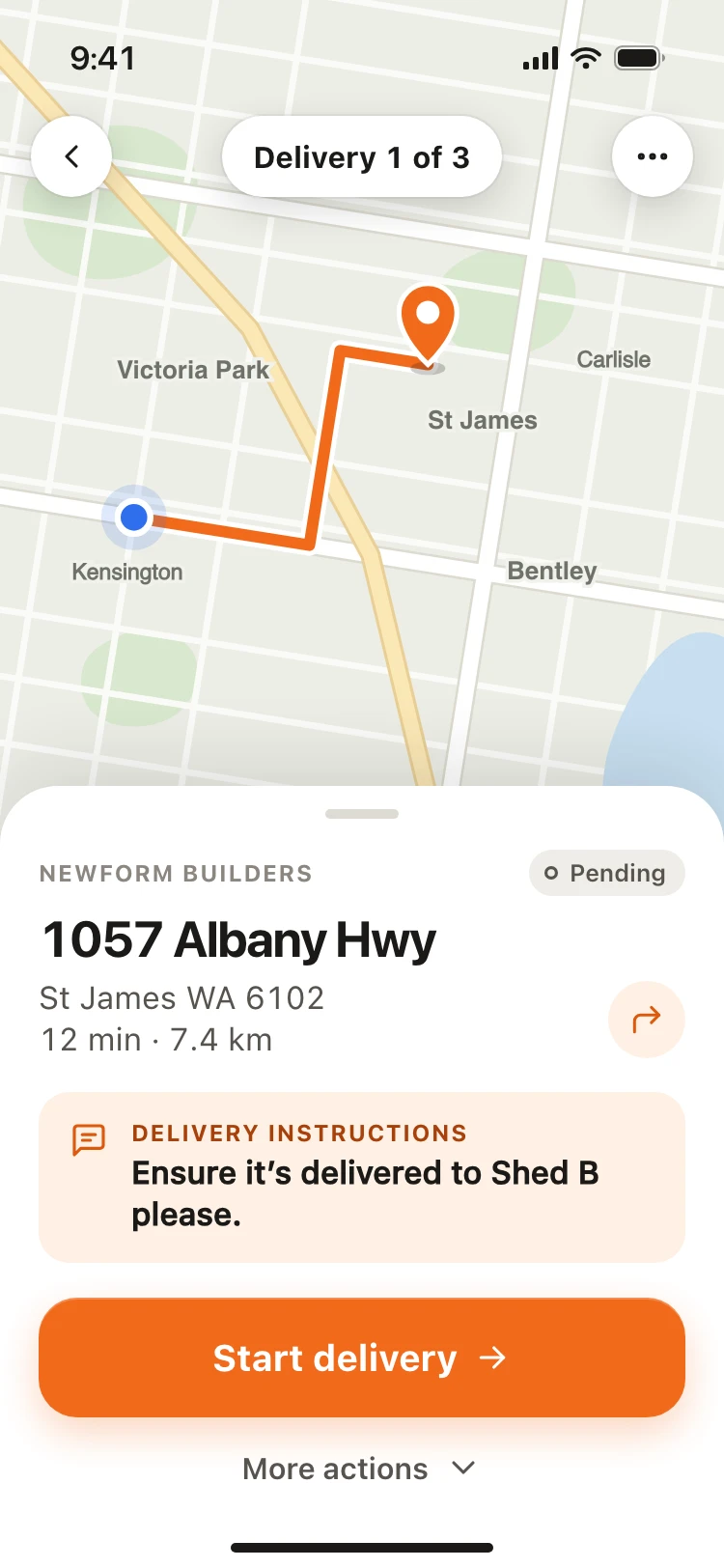
04 Drive to the site
Site instructions arrive with the address.
05 Prove the drop
One photo for each product category.
The office side
The deliveries list in the web app the office and manager use.
Where it landed
All three apps shipped, and the client runs its deliveries on them. I don't have measured results to publish, so I won't quote any.
What the client has now is an operation where the order, the pick, the load and the proof of delivery are one record.
One record
Order, pick, load and proof of delivery stay joined from start to finish.
Nothing retyped
A delivery starts from the order that already exists in the system.
Every handoff visible
Each person leaves something the next person can see.
Running an operation like this?
If your software and the physical work have drifted apart, and people are holding the gap together with phone calls and memory, that gap is usually where the design problem is.